Template Variable Input Types


Last updated Apr 6th, 2021 | Page history | Improve this page | Report an issue
Support the team building MODX with a monthly donation.
The budget raised through OpenCollective is transparent, including payouts, and any contributor can apply to be paid for their work on MODX.
Backers
Budget
$0 per month—let's make that $500!
Learn moreThere are a number of built-in template variable types.
Some input types are deprecated depending on your MODX version.
It's best to enter multiple Input Option values on a single line with no carriage returns.
Auto-Tag (autotag)
Auto-Tag is a convenient template variable for using tags when blogging, have multiple categories a resource can belong to, or anytime you need a list of tags that have been used before. Every time you edit or create a resource with access to an auto-tag template variable, you will see the tags that were used before. You can easily click on priorly used tags to chose them in the list.
To make auto-tag tvs useful in the front end, you will need to set the output type to "Delimiter" and specify a delimiter of your choice, and/or use an output filter to present it in the way you prefer. 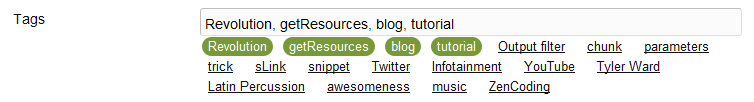 To output the tags in such a way that you each tag links to a certain resource and passes the tag in a GET parameter, you can use an output filter (snippet) as follows:
if ($input == '') { return 'Error'; } // In case the TV is empty
$tags = explode(', ',$input); // Based on a delimiter of ", " this will split each one up in an array
foreach ($tags as $key => $value) { // Loop through the tags
    $output[] = '<a href="'.$modx->makeurl(9, '', array('tag' => $value)).'">'.$value.'</a>'; // Add it to an output array, with a link to resource 9 and the get parameter.
}
return implode(', ',$output); // Merge the output array and output
All input option names (for use in migx options-json)
{
    "allowBlank": "true",
    "maxLength": "",
    "minLength": "",
    "regex": "",
    "regexText": ""
}
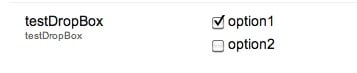
Check Box (checkbox)
Simple Usage
The basic usage of this is to simply define the field as a checkbox. You can control whether or not the box is checked by default or not by manipulating the "Input Option Values" and "Default Value" fields.
Checked by Default
- Input Option Values:
My Option==1 - Default Value: 1
Unchecked by Default
- Input Option Values:
My Option==1 - Default Value: 0
The box will be checked by default as long as the value following the "==" matches the default value. If you want to set default of a check box template variable to multiple values, you have to separate the values with the "||" delimiter.
Advanced Usage
You can distinguish between separate keys and values using double-equals and double-pipes:
option1==value1||option2==value2
More Advanced Usage
The Check Box input type allows multiple checkboxes to be displayed with a single TV. Set input option values in the option1==value1||option2==value2 format. To declare default checked checkboxes, supply the default value field with the option names, delimited by two pipes (||). You can use a @SELECT to select items from your database, e.g. Input option values:
@SELECT pagetitle, id FROM modx_site_content WHERE parent=35
If you are using multiple checkboxes like this, you will probably need to set the Output Type to "Delimiter" (e.g. a comma) so you can distinguish the values contained in each checkbox.
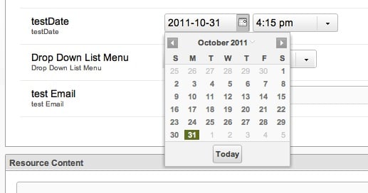
Date (date)
This allows you to set both a date and a time.
If you like to have a default set date you can put one of the following keywords inside the default value field (without quotes!). The "strange" logic behind the -X/+X values (which intuitively would be - for back and + for future) comes probably from a subtraction in the code somewhere, eg. now() - value, so if value is +72 this means now() - (+72), but - and + is -, so a positive value gets subtracted while with now() - (-72), - and - equals +, a negative value is added.
| Default value | Function |
|---|---|
yesterday |
Displays the day before todays date, time 12:00pm |
today |
Displays todays date, time 12:00pm |
now |
Displays todays date, current time |
tomorrow |
Displays the day after todays date, time 12:00pm |
+X |
X is an amount of hours BACK from the current time, eg. +72 means "3 days back from now" |
-X |
X is an amount of hours IN THE FUTURE from the current time, eg. -72 means "in 3 days" |
You use the Date TV Output Type to change the format of the Date returned.
All input option names (for use in migx options-json)
{
    "allowBlank": "true",
    "disabledDates": "",
    "disabledDays": "",
    "minDateValue": "",
    "minTimeValue": "",
    "maxDateValue": "",
    "maxTimeValue": "",
    "startDay": "",
    "timeIncrement": "",
    "hideTime": "false"
}
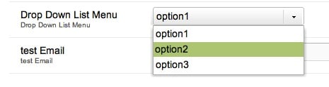
DropDown List Menu
NOTE: this TV Input type has been deprecated since Revo 2.1.x Please see Listbox input types below.
Set input option values in the option1==value1||option2==value2||option3==value3 format. Make sure to choose an output type of delimited (or other of your liking) to be able to present this to the front-end in a certain manner. You can also use a @SELECT binding to select 2 columns, e.g.
@SELECT name, value FROM your_table
Also see Resource List TV type.
All input option names (for use in migx options-json)
{
    "allowBlank": "true",
    "listWidth": "",
    "listHeight": ""
}
Email
This is a text field that comes with its own validation: only text that's in a valid email format will be accepted.

All input option names (for use in migx options-json)
{
    "allowBlank": "true",
    "maxLength": "",
    "minLength": ""
}
File
Creates a file input form to browse the server for a file. Files can be uploaded through the MODX File Manager. You can declare a default value file by specifying the path to the file.
Take extra note of relative file paths when using friendly url paths.
All input option names (for use in migx options-json)
Hidden
A hidden field does not show up in the manager, so it's rare that you'd use this option. You can set a default value that can be retrieved on all pages using this variable. Another possibility is to store a Snippet that takes a page's ID as input.
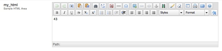
HTML Area (richtext)
This gives you a small WSYIWYG editor for the field. It looks exactly like the Richtext fields.
Image
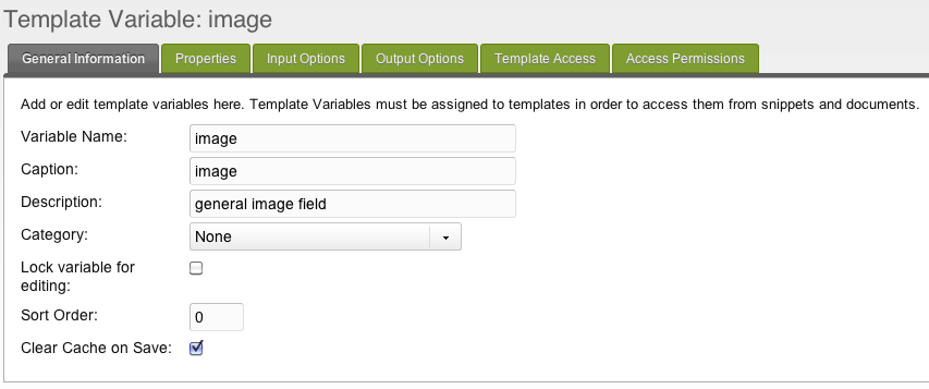
Creates an image input form to browse the server for a file. Files can be uploaded through the MODX File Manager then.
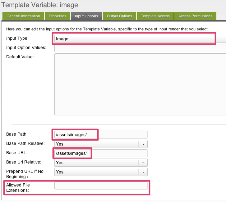
In MODX 2.2+ there are no input options for Image TVs anymore. Instead, head over to the "Media Sources" tab and choose a media source to assign to this TV for every context. You can configure base paths and the like in the Media Source.
-
You can declare a default value file by specifying the path to the image.
-
If you want to limit the images used for this TV to a specific folder, you can specify (since Revolution 2.1) a base-path and base-url. You can also set relative or absolute paths. Take extra note of relative file paths when using friendly url paths. For correct display of images in frontend and backend be sure to have correct settings in
base_urlandbase_pathsettings! -
You can prepend URL if filepath doesn't begin with a trailing slash.
-
You can specify file extensions that can be selected.
This input type returns the link (to be used as src attribute) to the image. You can also set the whole html-img-tag as a output-type.
Image+ (imageplus)
All input option names (for use in migx options-json)
{
    "targetWidth": "",
    "targetHeight": "",
    "targetRatio": "",
    "thumbnailWidth": "",
    "allowAltTag": "true",
    "allowCaption": "false",
    "allowCredits": "false"
}
Listbox (Single-Select) (listbox)
This has the same options available to it as the Listbox (Multi-Select) – see below.
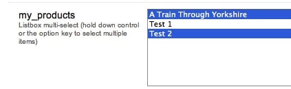
Listbox (Multi-Select) (listbox-multiple)
This behaves similar to the checkbox fields: you can select multiple items, and this field can be powered by a @SELECT binding in its "Input Option Values" parameter. Like checkboxes, you probably want to set the "Output Type" to delimiter so you can distinguish between values.
Simple Usage
Just like with the Checkbox options, you can simply specify a list of values separated by double-pipes:
Man||Bear||Pig
Separate Options/Values
Often it's nice to have a more readable label. You can display something nice and still store a different value using the double-equals and double-pipes format used by checkboxes:
Option 1==value1||Option 2==value2
All input option names (for use in migx options-json)
{
    "allowBlank": "true",
    "listWidth": "",
    "title": "",
    "typeAhead": "false",
    "typeAheadDelay": "250",
    "listEmptyText": "",
    "stackItems": "false"
}
Number
This is another text field with some pre-emptive validation. You literally cannot type anything but the digits 0 to 9, the minus sign (-) , and a period (i.e. a decimal point). A validation error is triggered if you enter more than one decimal point or minus sign. Complex numbers (e.g. using radicals "^" or "e" are not supported).
Note that trailing zeros are truncated, e.g. 4.50 gets trimmed to 4.5; this may make this input type unsuitable for currency fields.
All input option names (for use in migx options-json)
{
    "allowBlank": "true",
    "allowDecimals": "Yes",
    "allowNegative": "Yes",
    "decimalPrecision": "2",
    "decimalSeparator": ".",
    "maxValue": "",
    "minValue": ""
}
Radio Options (option)
Simple Usage
The basic usage of this is to provide a list of radio option. You can control the default option by manipulating the "Input Option Values" and "Default Value" fields.
Selected by Default
- Input Option Values: My Option==1
- Default Value: 1
The option will be selected by default as long as the value following the "==" matches the default value.
Advanced Usage
The radio option can be used to output more than simple numerical values. One such example is using the radio option to determine the chunk used for a sidebar.
Set your input option values using the format Title==value format, but use the chunk placeholders as your values. To declare multiple options use two pipes (||) after the value, before the next options title.
Sidebar Example Revolution
- Input Option Values:
[[$my_related_chunk]]||Content==[[*sidebar-txt]]||Twitter==[[$my_twitter_chunk]] - Default Value:
[[$my_related_chunk]]
In the above examples, you can output a chunk or another Template Variable without the aid of an extra.
All input option names (for use in migx options-json)
{
    "allowBlank": "true",
    "columns": "1"
}
Resource List (resourcelist)
Supply the definition with a resource ID, and you'll end up with a drop down list of all pages/resources that are children of that resource. The value stored after you've made a selection is the ID of the single selected resource.
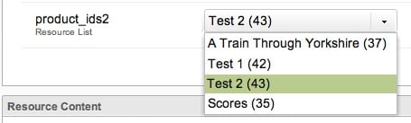
This is similar to using a @SELECT binding in a DropDown list menu, but the Resource List will traverse the entire resource browser, whereas with a @SELECT binding, you'd have to update your query to list children of each parent.
This input type also accepts WHERE conditions to filter by:
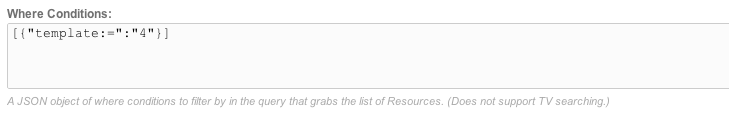
Another example:
[{"pagetitle:!=":"Home"}]
All input option names (for use in migx options-json)
{
    "allowBlank": "1",
    "showNone": "1",
    "parents": "",
    "depth": "10",
    "includeParent": "1",
    "limitRelatedContext": "0",
    "where": "[{\"isfolder: = \":\"1\"},{\"hidemenu\":\"0\",\"OR:hidemenu:=\":\"1\"}]",
    "limit": "0"
}
Rich Text
See HTML Area.
Tag
Multiple tags separated by || characters will be separated and output individually when used with the HTMLTag output type for formatting.
All input option names (for use in migx options-json)
{
    "allowBlank": "1"
}
Text
This is a vanilla text field.
As of MODX 2.1, there are three input options you can set for this TV:
- Allow Blank: yes/no, when "no" the resource cannot be saved without it being filled in.
- Max length: a number representing the number of characters that can be filled in in this field.
- Min Length: a number representing the minimum number of characters needed to be filled in. May want to use this with the allow blank option to "no".
All input option names (for use in migx options-json)
{
    "allowBlank": "true",
    "maxLength": "",
    "minLength": "",
    "regex": "",
    "regexText": ""
}
Textarea
This is a standard textarea field, with a height of 15 rows. It's the same size as the HTML Area fields, but without the WYSIWYG editor.
All input option names (for use in migx options-json)
{
    "allowBlank": "true"
}
Textarea (Mini) (deprecated)
This is a smaller textarea field, with a height of only 5 rows.
Textbox
This appears to be exactly the same as the vanilla Text field.
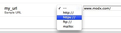
URL
This is a guided text field, which a dropdown option to select the protocol: none, http://, https://, ftp://, or . No validation is performed to ensure the correctness of the URL structure.
Support the team building MODX with a monthly donation.
The budget raised through OpenCollective is transparent, including payouts, and any contributor can apply to be paid for their work on MODX.
Backers
Budget
$0 per month—let's make that $500!
Learn more